 |
 |
 |
 |
 |
Create a Dynamic Layout
|
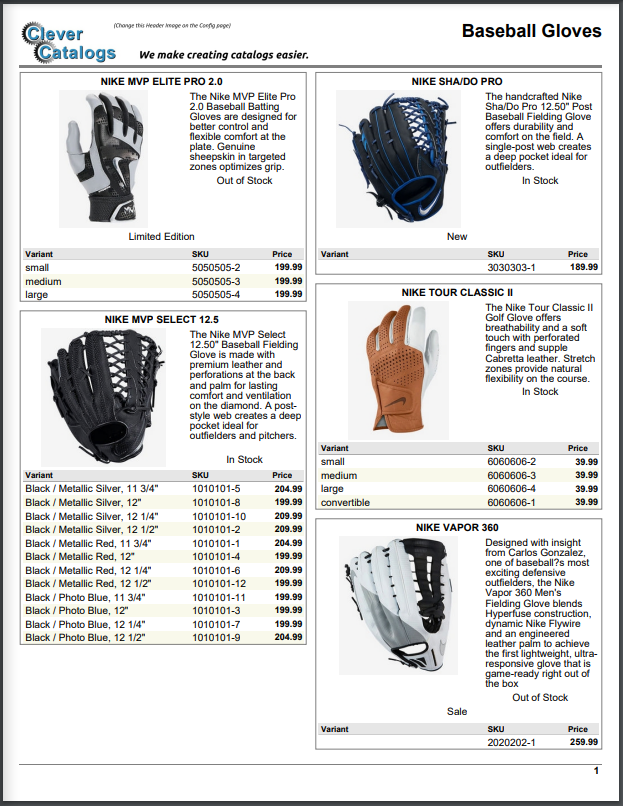
The biggest difference between Static and Dynamic Layouts is that images are constrained by the height reserved for them, not the width. In the examples on the Static (Grid) Layout Tutorial, the images are allowed to grow to a maximum width, which sets the height. If that were true in a Dynamic Layout, a tall, narrow image of a fishing pole could take up an entire page. So, the first step in creating a Dynamic Layout is to work out how big the images should be. Do this by creating a layout with just the Photo cell on it, set to a maximum width. Click the Preview button and adjust the cell height until you achieve the size you want. |
|
|
|
|
|
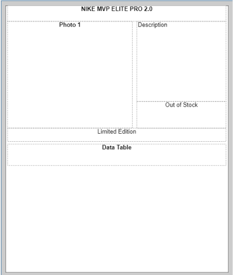
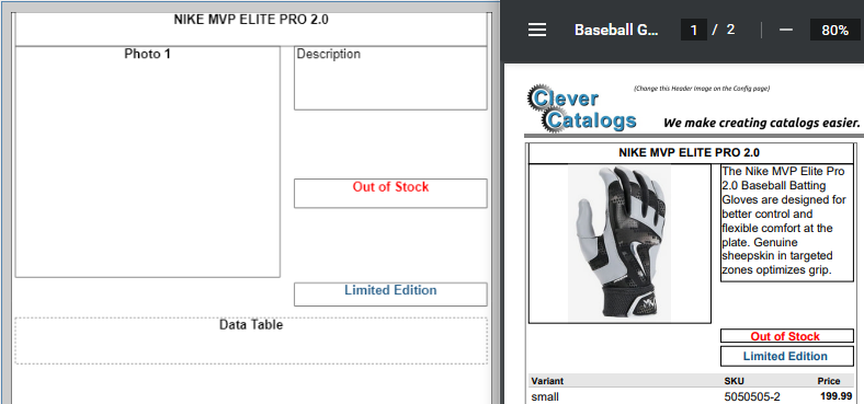
To better demonstrate how fields grow or shrink, borders have been added to the Layout above, and some fields have been colored for easier identification. The red "Stock" cell is much taller than the actual text, and so shrinks to fit. But it is too narrow for "Out of Stock", so does not shrink as much as for "In Stock". |
|
|
Here's a small change to the Layout to demonstrate another rule. The "Description" cell is made taller, "Out of Stock" is shortened, and "Limited Edition" is placed beneath them. When printed, the "Description" field shrinks because its text doesn't fill the space reserved for it. This causes "Out of Stock" to shift upwards, but "Limited Edition" doesn't move. This is because every field respects the distance between it and the one above, but also because CleverCat groups cells into Rows and Columns. In this example, "Photo 1", "Description", and "Out of Stock" are all in the same row on the Design Pad. Further, "Description", and "Out of Stock" are in the same column. But because "Limited Edition" is in a row of its own below the others, its position doesn't get changed by whatever happens in the column above it. |
|
|
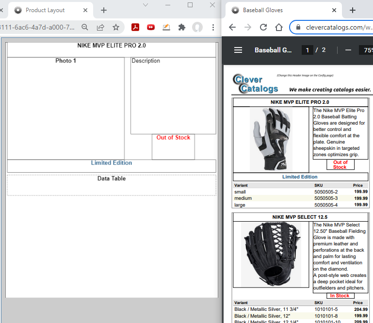
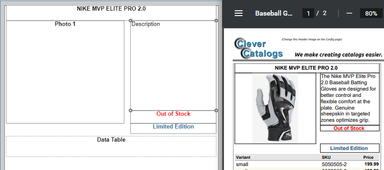
This can be made clear with another small change. The "Description" cell is made much shorter, creating a large gap above "Out of Stock". "Limited Edition" is placed beneath them in its own row, a small distance lower than "Photo 1". This time, "Description" grows to fit the text, and "Out of Stock" keeps the same gap between them. But there is no large gap above "Limited Edition", even though it's there on the Design Pad.
This is because Rows are adjusted before Columns. "Limited Edition" is still in its own row and thereby in its own separate column.
It happens to line up with the column above it, but is excluded from the adjustments made there because of the row separation.
|
|
|
In summary, you can use spaces between cells, but the results may be hard to predict. It's generally better to align cells with their edges touching (Don't overlap them), and use the Padding control on the Format Tab to create spaces. If you need assistance creating a template, contact [email protected] |