 |
 |
 |
 |
 |
Product Layout
|
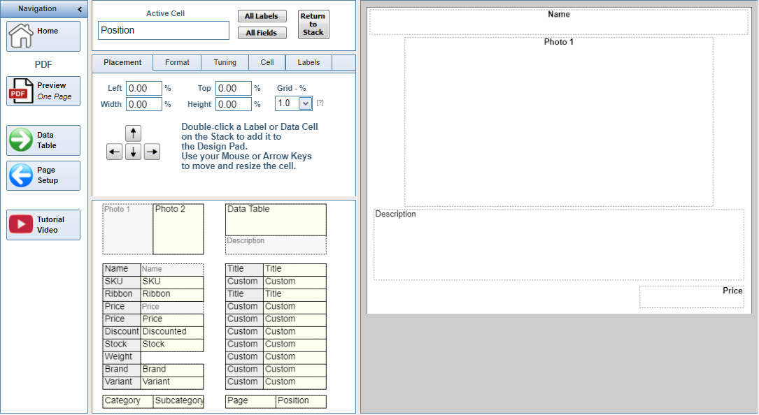
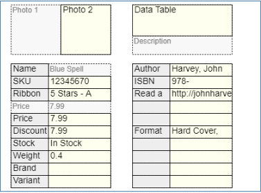
A Product Layout is the arrangement of text and images that make up the printed presentation. Only one Template can be assigned to a Category at any time. You design only one Layout for each template, and every Product in a Category prints using the same Layout. The Product Layout form is divided into five sections: The Navigation Panel is on the Left, and the Design Pad is on the right. In the middle are: Active Cell, Formatting Controls, and the Stacks. |
|
Design Pad
|
|
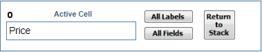
Active Cell
|
|
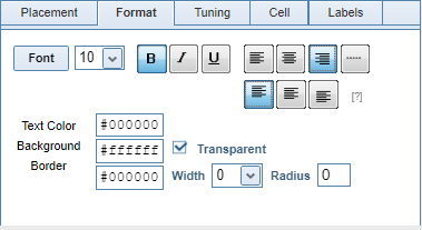
Formatting Controls
|
|
|
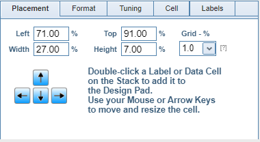
The Active Cell can also be moved around the Design Pad using the Four-Key directional arrow controls (highlighted in blue), and resized using the corresponding numbers (8, 4, 6, 2) on the full Numeric Keypad. Click any cell on the Design Pad to make it Active, then press the keys on your keyboard. |
NOTE: On some Browsers, the four-key directional arrows may not respond correctly. In this case, after selecting a cell to make it Active, press one of the numbered directional keys (8, 4, 6, 2) on the full Numeric Keypad to resize a cell. This seems to "initialize" the Four-Key arrangement.
|
|
|
|
|
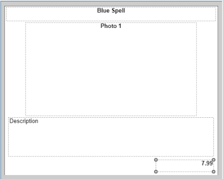
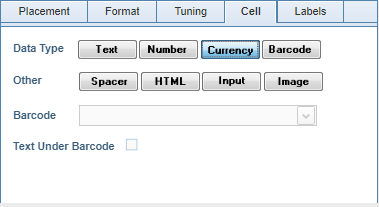
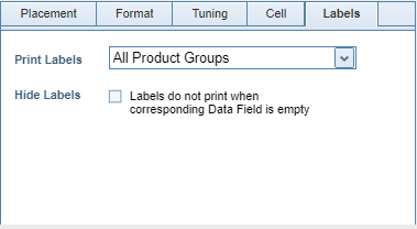
Cell The default Cell Type is either Text or Currency, which formats the text as a number with two decimals places plus a Currency symbol. For example, the text "50" will print as "$50.00". There are other Types to choose from. |
|
|
|
|
Stacks
|
|